Workshops
Workshops are offered by international, national and local scribes. They are usually held from 9am to 4pm on a Saturday and Sunday. They are a great chance to learn from some of the best teachers of calligraphy. Registration forms are emailed to current members initially and workshops can fill quickly, so be sure to be current on your membership so that you don’t miss out!
Also check our page of local Calligraphy Classes offered by Escribiente members.
If you have questions about our workshops, please email:
Our policies regarding priority registration for members, cancellations and refunds are posted on our Workshops Policy page.
UPCOMING WORKSHOPS:
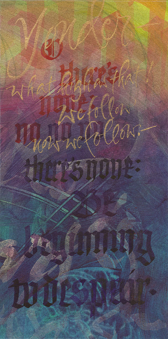
Watercolor & Rubberstamp Ink Backgrounds
Workshop with Diane Inman
In-person Mini Workshop in Albuquerque NM:
Saturday, April 11, 2026 from Noon – 3pm
Free (for members) in-person mini-workshop. Check your email for exact location.
A supply list will be provided upon RSVP to Evelyn so you can bring items you already have on hand. Supplies provided if you do not bring them.
Registration is open NOW! Limited to 18 students. Contact Evelyn Costello for info.
Weaver Writing
Workshop with Bill Kemp
In-person Workshop in Albuquerque NM
Sunday, April 12, 2026 from 9am – 4pm (WAS Saturday April 11th)
Registration is open NOW! Limited to 18 students.
Fee: $40 for current member
REGISTER ONLINE WITH PAYPAL/Credit Card
Non-members may choose Option 2 ($70, includes membership fee of $30).
Supply list emailed upon registration.
Location: Four Hills Mobile Home Piru Activity Center, Albuquerque, NM.
Weaver Writing is a simple, vertical script with just 26 letters. This script is super easy and is great for a one day workshop, allowing students to learn a script and become familiar with the pointed pen. This is a great opportunity to explore point pen writing at a greatly reduced rate.

Bill Kemp has been practicing his craft for over 40 years. While he also creates calligraphy with a broad-edged nib, pointed pen is his true love. Bill has studied with many notable instructors including Dick Jackson, Gwen Weaver (the creator of Weaver Writing), Master Penman Mike Kesceg, Deny Knight, John Stevens and his mentor, Master Penman William Lilly. Following eighteen years of study with Mr. Lilly, Bill completed his Certificate of Merit in Engrosser’s Script in November 2015.
Bill is an active member of Escribiente and IAMPETH and has taught at many IAMPETH conferences. He currently teaches online and in person to pointed pen students around the world. His calligraphy business is in Albuquerque, New Mexico where his clients keep him busy and where he gets paid to practice. Visit Bill’s website for more info and images billscalligraphy.com.
PAST WORKSHOPS:
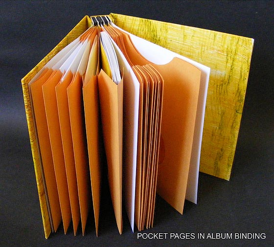
Drum Leaf Binding: The Seamless Page Spread
Workshop with Beth Lee
In-person Workshop in Albuquerque NM:
Saturday & Sunday, November 15 & 16, 2025
Registration is open NOW! Limited to 18 students.
Download Flyer / Registration Form PDF
Pay with Paypal (you do not need a Paypal account)
Priority for current members through October 24. Our workshop policy explained
The drum leaf book was invented by Timothy Ely with inspiration from traditional Japanese book structures. It is useful for photography compilations, scrapbooks, and all kinds of artist books. You’ll love this structure if you are daunted by the non-intuitive pagination that codex books require. You’ll love it if your motto is “Create first, figure out how to make it a book later.” You'll love it if you have single-side pages that you wish to make into a book. You’ll love it if you're not a fan of sewing. And you’ll love it if you want your content to flow seamlessly across the spread with no hitch or hiccup at the gutter.

In this two-day workshop we'll begin by making a simple version of the drum leaf book using supplied materials. This version is one that you may come to use for binding your workshop notes because it is so quick and easy. We’ll progress to some more “serious” variations, including at least one hardcover version. Along the way we’ll explore the freedoms and constrictions of the drum leaf book.
Beth Lee is a lettering and book artist living in Bozeman, Montana. She holds a fine arts degree in graphic design, and has worked as a freelance calligrapher and graphic designer since 1982. Beth has also taught calligraphy and book arts for 40 years, both locally and around the United States. Current work includes lettering on bespoke fly fishing rods and writing out historical documents for publishing projects. She is a founding member of Cyberscribes and the calligraphy correspondent for the national Guild of BookWorkers Newsletter. Her work may be found in university and private collections around the United States. Visit her website.
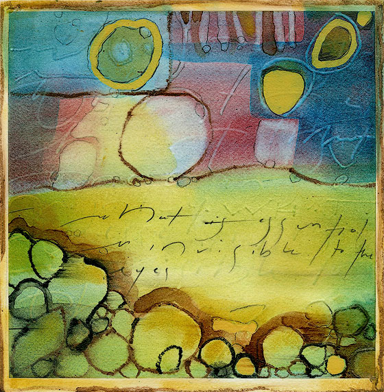
Out of Your Mind and on to the Page:
Art Journaling for the Fearful
Workshop with Nancy Hays Hills
Online Workshop: Four Mondays: April 28, May 5, May 12, May 19
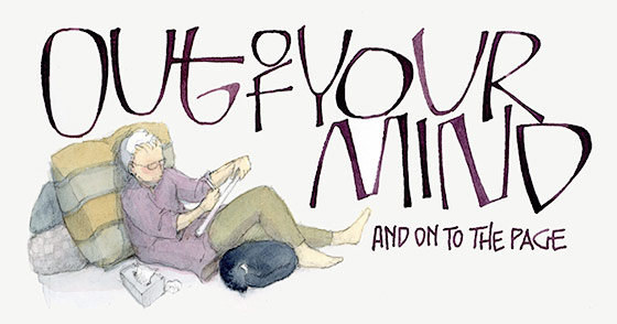
Making your own feast for the eyes and the mind – this class is designed to ignite your imagination and get your fingers moving to create your own special magic on the page. The class will start with a little Show and Tell, and then move on to making friends with the blank page in front of you. We’ll start with the basic tools I use in my journals – pens, pencil, and watercolor – and as the weeks progress, I hope you’ll add your own favorite tools and colors. You don’t have to be an expert at drawing or lettering or layout to take this class. Each of us will start right where we are, and learn by doing. The most important thing to bring to class is your willingness to pour out your heart on to the page. It is that, more than your artistic skill, which will give your journal its value, and make it uniquely yours.
Members can enjoy Nancy's art journals by watching the replay of the February 2025 program. See your email for a link.
Nancy Hays Hills is an artist and Episcopal deacon living in Milwaukee, Wisconsin. Her working career was in the field of advertising and graphic design from which she retired in 2020 to devote more time to her dual vocations of ministry and art. She shares a home with her husband Julian, and her trusty feline sidekick, Samantha.
She began drawing as soon as she could hold a crayon, and was lucky enough to have parents who encouraged their shy child to express herself on paper. She took her first calligraphy course at age 17 and has incorporated lettering in her art ever since.
In addition to individual pieces, she has been working in art journals for over 20 years, and her artwork from those journals has appeared in Alphabet, Bound & Lettered, and in the most recent Speedball Textbook.
Mini Workshop Weekend
Four sessions with three different instructors!
Workshop in Albuquerque, New Mexico
Saturday–Monday, November 16–18, 2024
FOUR mini classes, 3 hours each.
Workshop Reviews in our Winter 2024-3 Newsletter.
Session A – A Book of Letters | Michal Sommers
If you’re like most artists, you probably have a sheet (or two) of decorated paper in your stash from a paste paper or painting workshop. Let’s turn that into an eye-catching book with Neuland-inspired playful letters. You’ll design and arrange the letters to create a short phrase or greeting in a custom book made from a single sheet of paper, then add a belly band to hold the book closed.
Examples of various book structures and lettering layouts will be available. Time permitting, tips on painting your paper will be offered, as well.
Session B – Holiday Stamp Party | Michal Sommers
 Put your holiday to-do list on repeat in this workshop. You will design and make two stamps for printing on paper or fabric using conventional carving tools and materials. Use them later for gift tags, envelopes and cards, gift wrap and gift boxes, tea towels, prints ready to frame and more. You’ll learn techniques to create both simple and repeat patterns and apply color layering options for dynamic results. Michal will also offer tips on making stamps from household items with no carving involved!
Session C – Five Fast Books for Calligraphers | Esther Feske
 You will learn simple techniques to make books, including how to make a book out of single sheets of calligraphy when you didn’t plan to make a book originally.
Extensive instructions, including variations, and paper to make your take-home models will be supplied.
Esther will bring some tools to share.
Session D – Introduction to Gothic Cursive | Trish Meyer
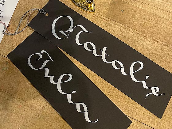 Gothic Cursive, a script that co-existed with Textura as early as the 12th Century, has a wonderful rhythmic flow with a back-leaning feel and opportunities for exaggerated ascenders and descenders. Trish was inspired to learn this script after seeing a page from a 16th Century manuscript.
She first taught herself how to write
it using exemplars found in various books followed by more input from online classes.
It’s been suggested that Gothic Cursive came about as writing became more widespread. Because students needed to copy their courses as they were being dictated, the act of writing became increasingly rapid and more cursive. This “running style” script uses a broad-edged nib and is a fun alphabet to learn. Its expansive width works well for writing bookmarks, especially for short names. You can pair this miniscule hand with capitals from almost any blackletter style from Textura to Fraktur.
Hand Lettering with the Folded Pen
Workshop with Cora Pearl
In-Person Workshop in Albuquerque, New Mexico
Saturday & Sunday, March 16 & 17, 2024
The folded pen is a wonderful tool for hand lettering and calligraphy—it can make very thin hairline strokes, thick dramatic strokes as well as a large range in between. Letters created with the folded pen feel dynamic and organic. There are endless possibilities for its use.
In this workshop we will make a folded pen with a “Cora Pen” style curved nib that we will use in class, and we will learn several distinctly different styles of lettering that will help us explore what this type of pen can do. We will create a finished piece using the lettering learned in class. This class is ideal for calligraphers who want to explore playful lettering styles, graphic designers who would like to incorporate hand lettering into their designs and for lovers of hand lettering who want to learn more lettering styles and the use of a new versatile tool.
CORA PEARL started studying calligraphy at age 11 and has been doing calligraphy and hand lettering ever since. She has a BA in Art and Art History from Oberlin College. Cora works as a full-time calligrapher and teacher of lettering arts—she teaches full credit calligraphy and hand lettering courses at Portland Community College in Portland, Oregon, and teaches independent workshops and classes, including year-long courses in Design for Lettering Art. She has taught at several calligraphy conferences including Letters of Joy, IAMPETH, Letterfest, TypeCon, the International Calligraphy Conference, and Letters California Style.
Cora teaches both in person and online and has taught over 1800 hours on Zoom. Cora is passionate about the art of teaching and values a holistic approach to learning based on building trust and safety in the classroom environment. Visit Cora’s website.
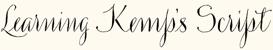
Learning Kemp’s Script
Workshop with Bill Kemp
In-Person Workshop in Albuquerque, New Mexico
Saturday & Sunday, November 11–12, 2023
View Workshop Preview PDF from recent Newsletter
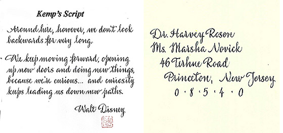
What would you do if a client handed you a sample of a script font and asked you to address envelopes in the same style? And what if you only had a partial set of lowercase letters to work from?!
Bill rose to this exact challenge by researching similar script typefaces and, coupled with his extensive knowledge of pointed pen scripts, he developed a full alphabet to fit the client’s needs. Bill says that “It not only had to look similar to the sample, but be readable and appropriate for the envelopes and place cards.”
Kemp’s Script is a versatile vertical script that can be written with a pointed pen in either an oblique or straight penholder. Bill has used this script to write poems and short quotes and he now wants to share it with you!
BILL KEMP is a lettering artist but has been told by his mentor, the late Mr. William Lilly, that he is an Engrosser. Bill has been practicing his craft for over 40 years. While he also creates calligraphy with a broad-edged nib, pointed pen is his true love and Engrosser’s Script has been his main focus for many years. Bill has studied with many notable instructors including Dick Jackson, Gwen Weaver, Master Penman Mike Kesceg, Deny Knight, John Stevens and his mentor, Master Penman William Lilly. Following eighteen years of study with Mr. Lilly, Bill completed his Certificate of Merit in Engrosser’s Script in November 2015.
Bill has served as the president of Escribiente and IAMPETH and has taught at many IAMPETH conferences. He currently teaches online and in person to pointed pen students around the world. His calligraphy business is in Albuquerque, New Mexico where his clients keep him busy and where he gets paid to practice. Visit Bill’s website for more info and images.
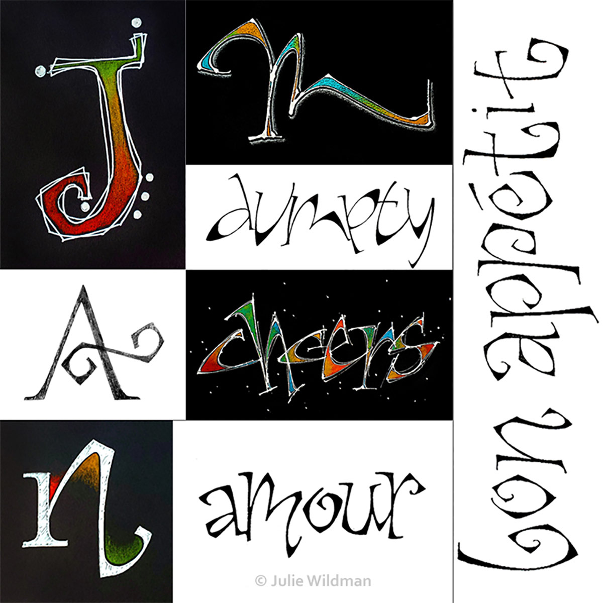
The Inside Curve: Drawn Letters
Workshop with Julie Wildman
In-Person Workshop in Albuquerque, New Mexico
April 22–23, 2023
Workshop Review in our July 2023 Newsletter.
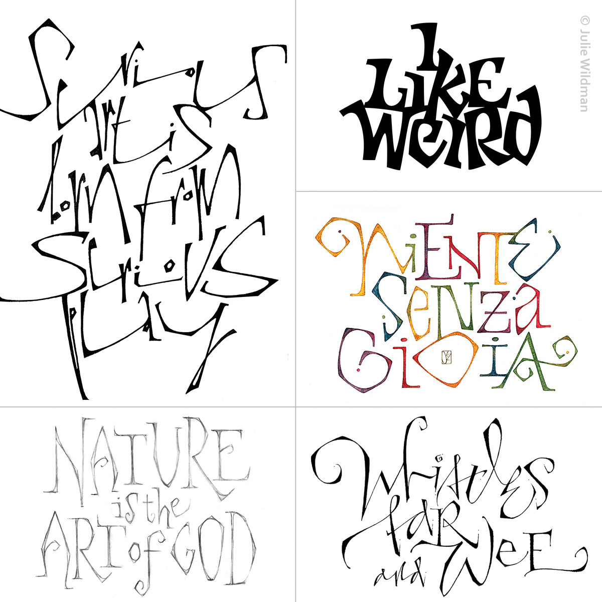
This playful hand was created several years ago while I was in a workshop. I was working on a specific piece and the instructor noticed that I was keeping an inside curve on the letters, while doing the outside angular.
Later, in another workshop, I pulled out that piece and designed the ‘Niente Senza Gioia’ piece you see in my samples.
The distinctive features of the letterforms are the inside curve, while the outer part of the letter is angular. How that is achieved is where the fun comes in! These letters are primarily meant to be drawn, not lettered with a specific tool. However, once students understand the underlying structure, these built-up letters can lend themselves to a variety of applications.
Together we will learn the basic forms, then branch out into variations. We will work with pencil, colored pencil, various inks, watercolors and metallics on an assortment of papers. We will also try a few compositions, working with layout and design principles to achieve some interesting results.
Suitable for beginners and experienced letterers alike.
About Your Instructor:
Julie Wildman is a professional in the fields of graphic design, commercial lettering, calligraphy and workshops. Her studio is in northwest Indiana, only 30 minutes from downtown Chicago.
Her calligraphic interest began in the late ‘80s after a friend gave her Timothy Botts’ book “Doorposts,” and she saw the written word illustrated in such a way as never before. About ten years later, she had the privilege of taking a year-long class with an internationally known calligrapher and was hooked. She joined the Chicago Calligraphy Collective soon after and embarked on a lifelong journey of studying letters.
Since then, her work has been exhibited in juried shows throughout the Midwest and the U.S., including the Newberry Library in Chicago.
In 2007 and 2014, her pieces “Psalm 117” and “An Alphabet Book,” respectively, won the Newberry’s Purchase Prize Award and became a part of the Library’s permanent collection. Her work has also been published in many issues of Letter Arts Review, Bound & Lettered, and various other type and lettering publications.
She loves line, shape, color, texture, paper, ink, and paint and often can’t believe she gets to play with them for a living! She enthusiastically shares her love of “beautiful writing” with young and old by teaching calligraphy for staff development classes, on-site promotional events, community programs and personal growth workshops throughout the Chicagoland area, U.S., and Canada. And now with Zoom classes, she has taught students from more than 22 countries around the world.
Learn more at Julie’s Website
Capitals as Text & Tiny Paintings as Graphical Elements
Workshop with Beth Lee
In-Person Workshop in Albuquerque, New Mexico
Saturday & Sunday, November 5 & 6, 2022
The complexity of monumental Roman capitals can be intimidating for many calligraphers, but tiny pen-made capitals can be a real delight. Writing at “human” size more naturally creates rhythm and movement that is difficult at a monumental size. Arranging those small capitals with another graphic element can help us to connect with the fun of lettering while surveying some basic design principles.
In this workshop we will explore Roman capitals as a text hand. We’ll begin by reviewing the shapes and proportions of Romans, and then shrink them down to 1/4-inch size and even smaller. What must we lose in the reduction, and what can we add back with pen pressure, rhythm, serifs? We’ll find out. We’ll also investigate adjustments to our materials – pen nibs, writing fluids, writing surfaces – that will set the stage for marks that are as clean and precise as possible. Through the use of letter spacing, color changes, and other design decisions, we’ll manage the texture and rhythm of our texts.
Then we’ll paint 2-inch-square landscapes and a few abstract graphic elements and look at what design choices will ensure that they meld beautifully with our texts.
Suitable for beginners and experienced letterers alike.
About Your Instructor:
Beth Lee holds a Bachelor of Fine Arts degree from Florida State University and currently resides in Bozeman, Montana. She has worked as a freelance calligrapher and graphic designer since 1982 and has taught calligraphy and book arts for 30 years. Her work has been featured in Letter Arts Review and is included in collections of the Beinecke Rare Book Library, Baylor University Moody Library, Bainbridge Island Museum of Art, and other institutional and private collections around the United States. She is the calligraphy correspondent for the Guild of BookWorkers Newsletter and the editor of Montana’s Big Sky Scribes journal, Nota Bene.
Learn more at Beth’s Website
Fantastic Flourishing Workshop
Workshop with Holly Monroe
Saturday & Sunday, May 14 & 15, 2022 * Online via Zoom with Replays for 2 months
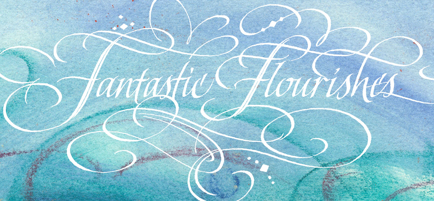
In this workshop, Holly shares 42 years of italic experience – the good, the bad and the ugly when “fine-tuning” your Italic. Better yet, she will share how to make your Italic letters strong and beautiful as they dance on the page. We will trouble shoot particular letters and their letter families. To give our Italic a greater “presence” in our designs, we will study the construction of flourishes, breaking them into parts and then learning how to recreate them – with pencil first, and then with various strokes of the broad-edged pen. Where and when to use them will be discussed, as well as how to add unique embellishments to the flourish. The flourishing principles taught will encourage creative thinking. You will be challenged with a project, flourishing in the round – a spiral or circular design incorporating your chosen words, with fantastic flourishes woven around its circumference using fine art tools and materials. Come join us for two creative days of fun! Flourishing is an elegant dance on paper!
About Your Instructor:
Holly V. Monroe is a third-generation calligrapher with a deep appreciation for beautiful lettering and fine art. Tutored by her mother in art and her father in calligraphy, she has since studied under some of the world’s finest calligraphy instructors. In 1980, Holly opened her studio in Cincinnati under the family name, Heirloom Artists, and in 2015, she moved to Lake Oswego, Oregon. Holly’s motivation is “to feed the soul by making meaningful words beautiful.” She captures inspirational texts with flourishes, florals, illustrations, and colorful hand lettering, specializing with calfskin and illumination. Private and commercial commissions comprise much of Holly’s work, and she shares her 42 years of experience in a variety of calligraphy workshops, even on cruises.
Learn more at Holly’s Website
Small Art; Big Ideas
Workshop with Rebecca Wild
Saturday & Sunday, November 6 & 7, 2021
This idea-packed workshop will introduce you to new techniques that integrate art and words. Working on small format paper, 7˝ x 7˝, you will combine drawing materials, acrylics and hand cut stencils with handwriting (no matter how readable) to create a series of richly layered, meaning-full pieces. All the user-friendly methods taught will link together to allow endless possibility for individual expression and enable you to add greater depth to your art. You will complete the class with a stunning series that is luminous in both surface as well as personal reflection, a set of detailed instructions and a hand-built portfolio to house your “small art.”
About Your Instructor:
Rebecca Wild is an artist and calligrapher from the Port Townsend, Washington. Her work pairs a love of letter forms with the luminous qualities of drawing materials and paint. She was a calligraphy and art instructor in Portland, Oregon for 25 years and now teaches workshops for art centers and guilds throughout the West Coast. Rebecca is an enthusiastic and organized instructor whose emphasis on process and technique is infused with creativity and encouragement. She strives to help beginners feel successful and to give established artists fresh ideas. Her goal is to make the making of art accessible to everyone.
Learn more at Rebecca’s Website
Power Pages: Design Techniques
Online Workshop with Barbara Close
January 30 & February 6, 2021
Workshop review & images in our 2021-01 Newsletter.
Our imaginations can take us to new heights – if we allow them to do so with open minds and a will to explore new territories. Barbara will show techniques for designing page layouts without intimidation. Fun, step-by-step processes will be reviewed as well as thinking outside the box. You’ll be creating the art you once dreamed of with full confidence and joy. The essential calligraphic quality of marks and lettermaking will be stressed. Many unusual tools will be employed to help create these POWER PAGES.
About Your Instructor
 Barbara Close is an internationally renowned calligrapher, designer and instructor with a passion for creativity and a love of lettering. She encourages her students to create appealing calligraphic art using a wide variety of mixed-media techniques.
Barbara loves the exhilaration of discovery in playful experimentation along with skillful execution: “Finding one’s own path is a true quest of mine – and I love sharing this with others.”
Barbara’s studio is located in La Mirada, California, where she teaches online to students both locally and around the world. She shares her signature contemporary pointed pen style in Pointed Pen Possibilities, a series of professionally recorded online classes hosted by Sandia Workshops. She has taught at several national and international lettering conferences, including IAMPETH and Lettering CA Style.
For more images, visit Barbara’s website.
Pointed Brush Experience
Workshop with Mike Gold
Two days: August 29–30, 2020 * Online via Zoom
The pointed brush is a great tool to explore both traditional and non-traditional lettering and has applications for both commercial and fine art.
In this workshop, you will experiment with synthetic and natural hair brushes in order to see the benefits and uses of each. You will practice with various inks and paints and try out different writing surfaces. Beginning with a basic pointed brush alphabet, you will explore various ways to modify and develop pointed brush letters into readable and more abstract forms. You’ll also learn to create both traditional and non-traditional compositions using brush lettering by practicing a variety of exercises.
About Your Instructor
 Mike Gold has worked as a commercial lettering designer for over 30 years, mostly in the social expressions business. But his real passion is exploring the corridors of calligraphy that have been less traveled, the path where words and letters are design elements with which to play with line, shape and form, where creating a visual statement is more important than writing a readable text. In both his professional and personal art, Mike breaks traditional rules to create contemporary, non-traditional work.
Collaboration has been a feature of some of his personal work. He especially cherishes the work and teaching he did with Judy Melvin and his 25-year involvement with Scribes 8, a collaborative group based in New Mexico. Over the last 15 years or so Mike has worked mostly on his own, developing a practice that builds on the traditions of the past, influenced by art and artists of all kinds.
Mike has an M.A. in Visual Communications and has studied with many outstanding lettering and design masters over the years, and has taught around the country and at several international calligraphy conferences. He is the author of Lines to Live By, which is Mike’s take on being a non-traditional calligrapher in the 21st century.
For more images, visit Mike’s website.
Pointed Pen Possibilities
Workshop with Lee Ann Clark
Two days: November 2 & 3, 2019
Modern pointed pen is everywhere – from elegant and sophisticated, to fun and whimsical, to downright funky – there is a modern move for any occasion. Fundamentals and confidence in using this versatile tool are key to making your writing jump off the page. This course is designed to explore some variations and twists to add that updated flair.
Using a formal hand as a starting point, we will work to methodically break down and reconfigure letterforms and their relationships to each other to develop a more modern, personalized style that still retains some of the classic elements that make pointed pen calligraphy so unique. Examining joins, letter endings and flourishes will help to refine your own hand and take your work to some new and surprising places. A study of the capital letters and how to intermix them in unexpected manners will add even more interest.
Throughout the process, layout and design will be discussed (and practiced) as we work toward a completed composition. Some knowledge of pointed pen is recommended.
About Your Instructor
 Lee Ann Clark began her love of letters and calligraphy while living in the Pacific Northwest. A BFA in graphic design and workshops/classes with a plethora of talented calligraphers led her to make calligraphy the main focus of her work – primarily in the social stationery realm. Since relocating to the East Coast in 2003, she continues to work as a commercial artist in a variety of styles, mostly for print production, but also producing original artwork. Concentrating primarily on pointed pen, Lee Ann also teaches workshops and has just completed a series of ongoing classes for Smithsonian Associates. Her clients have included Alpine Creative Group in New York City, the National Gallery and Kennedy Center Honors. Recently, the largest change in her calligraphic career has been accepting the position of Chief Calligrapher at the White House. In her other life, Lee Ann and her husband run a pastured poultry farm outside of Baltimore.
Roman Caps: Pattern and Texture
Workshop with Annie Cicale
April 5, 6, and 7, 2019
Download PDF Flyer for more images, Registration form, and supply list.
 The budding scribe is tempted by the expressive qualities of letters made by hand as they start out on their life-long path of studying fine writing. Many students are terrified of Roman letters because somewhere along the way they have heard they are “difficult.”
We will diffuse that fear by beginning with an analysis of traditional proportion systems and then experiment with some modern variations. Adjusting spacing, speed, and proportion can give an infinite variety of forms. Spacing Romans well is critical, and we will explore ways to make it become second nature. Annie will guide you as you explore approaches to these forms through both controlled and spontaneous exercises.
After working with these basic Roman letter shapes, we’ll work with ways of expanding your vocabulary of scripts through both analytical and intuitive exercises. By using a variety of tools, you’ll find variations and individuality. We will touch on flat brush Romans, such as those found in early Roman architecture.
Each of you may choose a different path of study, and we all might end up in different places! We’ll document our initial studies in journal form and progress to the grandest pages we can muster.
About Your Instructor
Annie Cicale teaches calligraphy, drawing and painting throughout the United States and Canada. Fascinated by writing as a child, her first Osmiroid fountain pen led her to the world of calligraphy. She has experimented with the word as image in her paintings, bringing a visual expression to the words to expand their meaning. She incorporates both abstract and illustrative imagery in her paintings and books. She has been on the faculty of most of the international calligraphy conferences, and her work has been published in many of the calligraphic anthologies. Her artist’s books are in private and public collections, including Yale University. She is the author of The Art and Craft of Hand Lettering, published by Bloomin Books. Visit her website.
David Jones Capitals
Workshop with Joke Boudens
November 3–4, 2018
View Flickr Photo Album from this workshop
 The letterworks of David Jones (1895–1974) are unique. He was inspired by naïve historic examples of lettering as the ones you still can see in the Roman catacombs. That’s why his work is not at all perfect but sensitive and charming. We will be inspired by Jones’ work by studying his special letterforms and the distinct layouts he uses. We worked on our own versions of letters, developing our own lettering style and thus trying to give the whole a personal touch.
Letterforms were first be drawn with pencil, then filled in with paint. We were given a lot of tips from scratch to final. Every student created a quote or short text. See Flickr album for photos.
About Your Instructor
Joke Boudens is a Flemish lettering artist, living and working in the medieval city of Bruges, Belgium. Lettering and illustration are her passion and she is well known for her small manuscript concertina books. Joke says: “I’m constantly looking for poetry and beauty by arranging and combining text elements and small drawings. In my fine lettering – drawn, painted or written – I apply a variety of techniques, including gilding. Colour is a very important part of my work, although ever more I like the black and white in illustration, hand lettering and logotype. Apart from languages and poetry, I get my inspiration from nature, gardening, music, history, and my own happy family.” Visit Joke’s website at jokeboudenslettering.com
The Foundational Hand
Workshop with Randall M. Hasson
April 21–22, 2018
View Facebook Photo Album from this workshop.
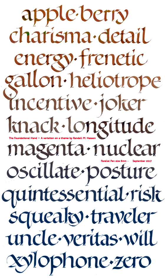
For beginning or intermediate students, this workshop will work with the analysis, structure and mechanics of a calligraphic hand called Foundational. We will begin with familiarizing ourselves with the characteristics of the letterform and use tools that facilitate ease of writing. We will also delve into the history and evolution of the chosen letterform, creating historical context for the style of writing and familiarizing ourselves with its characteristics such as entry and exit strokes, proportion, branching and size & weight. We will look at examples of how contemporary calligraphers work with the basic hand.
For beginning students, day two will continue work with these forms while intermediate and advanced participants will have the option of working on variations of the foundational, using techniques and tools to modernize the hand to suit their own style and personality. We’ll address beginnings, endings and alternate forms to give your Foundational Hand a personality of its own.
About Your Instructor
 Randall M. Hasson is an artist, calligrapher, instructor and speaker who has appeared on the faculty of Arts, Lettering Arts, and Educational Conferences in the United States, Canada and England. He has authored articles on a variety of lettering art-related subjects and recently
co-edited the 24th (Centennial) Edition of The Speedball Textbook. Randall has spoken for the C.S. Lewis Foundation in Oxford England, and has appeared on the faculty of fifteen International Calligraphy conferences as a mainstage presenter and/or teacher with lecture topics covering Public Art, Art History, the Painting Process, Collaborative Art Projects, and the History of Writing.
Randall M. Hasson is an artist, calligrapher, instructor and speaker who has appeared on the faculty of Arts, Lettering Arts, and Educational Conferences in the United States, Canada and England. He has authored articles on a variety of lettering art-related subjects and recently
co-edited the 24th (Centennial) Edition of The Speedball Textbook. Randall has spoken for the C.S. Lewis Foundation in Oxford England, and has appeared on the faculty of fifteen International Calligraphy conferences as a mainstage presenter and/or teacher with lecture topics covering Public Art, Art History, the Painting Process, Collaborative Art Projects, and the History of Writing.
Paste Papers that Sing
with Elizabeth McKee
October 21–22, 2017
View Flickr Photo Album from this workshop
Paste paper had its origins about 450 years ago when book binders added paint to their paste and used it to make patterned paper, thus creating an inexpensive decorative paper for end papers. Many of us first encountered paste paper in primary school where it is known as finger paint. More recently calligraphers realized that paste makes an excellent surface on which to letter.
Blackletter & Fraktur
with Yukimi Annand
April 22–23, 2017
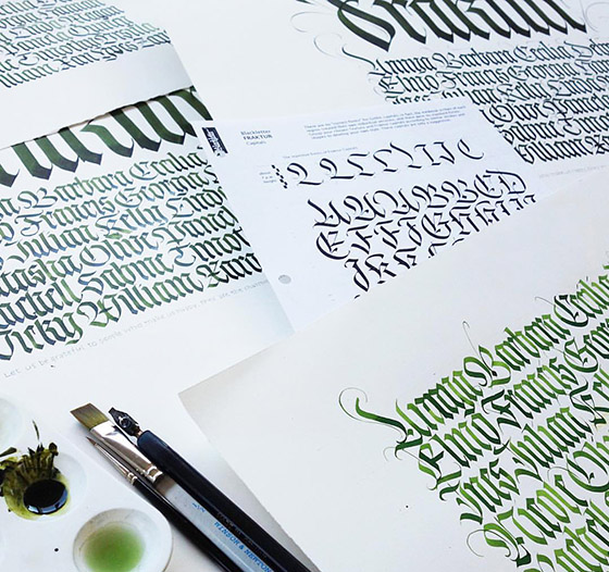
Yukimi taught her gorgeous Blackletter hand at our April 2017 workshop!
Visit Yukimi's website's Blackletter page for more images.
Blackletter evolved during the Gothic Period of the Middle Ages. The beautiful texture which was made with tightly spaced vertical strokes was characteristic. There are many styles of Blackletter including Gothic cursive.
In this workshop we started from historical background of Blackletter. On the first day, we studied the basic structure of Gothic Textura including consistency of form and spacing. On day 2, we analyzed samples of Fraktur to find the relation and difference between the forms of Texura and Fraktur. We practiced with Yukimi’s Fraktur exemplar that is a combination of Friedrich Neugebauer’s and Claude Mediavilla’s. Aiming to write beautiful strokes of Fraktur, Yukimi explained in detail the changes in pen angle, pen manipulation and more. Those instructions were given with chisel nibs, wide marker and/or flat brush.
Contemporary Decorated Letter
Workshop with Nancy Culmone
September 24–25, 2016
View Flickr Photo Album from this workshop
Our class is about exploration and the only requirement is an adventurous spirit. Beginning with a series of structured yet experimental exercises, you will create unique, contemporary alphabetic forms grounded in the venerable tradition of decorated letters. Your letters will run the gamut from elegant to edgy, whimsical to bold to fragile.
Our work sequence begins with black and white, then moves into color, and includes paper cutting, painting and color-mixing techniques. We will explore the mark-making potential of traditional and a-typical tools, all while developing your unique vision, color sense, and visual skill. Expect examples and demonstrations to guide and inspire you.
Whether simple or elaborate, a decorated letter can act as an illustration for your text, set the stage, prepare the reader, inform us of your views and feelings or stand alone as a letter portrait.
How much can one letter convey? Discover which styles of decorated letters delight your eye.
Finally, you will create a portfolio to house your letter images, and leave with a variety of methods for inventing new forms long after the course is over.
 The Victorian Pen
Workshop with Heather Victoria Held
April 23 & 24, 2016
View Flickr Photo Album from this workshop
Heather led students through simple drawing exercises which were then transformed into innovative decorative designs. The pointed pen was combined with coloured pencil, watercolour and gilding in this workshop. We focused on traits and colours that were popular in Victorian decorative designs. Starting with simple corner flourishes we gradually expanded into more intricate and detailed designs.
Visit Heather’s website for more images and her biography.
Lettering in 3D!
Workshop with Julie Gray
January 23 & 24, 2016

View Flickr Photo Album from this workshop
In this fabulous workshop, Julie Gray helped us move our calligraphy into a new dimension! Paper sculpture combines nicely with calligraphy to extend our artistic endeavors to a whole new level. More details and images...
A Sharp Pencil and a Keen Eye
Graphite Techniques for Calligraphers
Workshop with Amity Parks
September 26 & 27, 2015
View Photos from this workshop on our Flickr page.
In this class, the humble pencil and its relatives became powerful tools for creating many effects from subtle to stunning. We used pencils, erasers, graphite sticks/blocks, powdered graphite and their water-soluble cousins to explore the possibilities of this medium.
Starting with basic drawing principles like line quality and shading, we experimented with each tool to discover the marks it could produce. We then moved on to drawing letters and designing word groups, both formal and casual. Amity also shared many tips and tricks she's learned to save time and ensure success when working with this versatile medium.
See more of Amity's art on her website.
Mastering Italic with Carrie Imai
April 25 & 26, 2015
View Photos from this workshop on our Flickr page.

Italics is a beautiful, flowing and consistent style of calligraphic lettering. It is a good alphabet to begin your calligraphic education or early in your training. You will find yourself using this alphabet most often.
Carrie's workshop included an in-depth study of the Formal Italic alphabet through demonstrations and hands-on attention. We studied each of the components of the alphabet (what makes it look the way it does) and used this information to determine how your personal italic can be improved. Carrie explained pen angle, structure, branching and shape. We also enjoyed making popup cards, received a great introduction to pen manipulation, and created a handmade book to hold month inserts.
 We also learned how to fix new, old and yucky pens so they become "good" pens.
Carrie Imai’s teaching career began at Brandes Art Institute in 1983. She has taught ongoing classes and workshops locally for the Los Angeles Society for Calligraphy, Hughes Aircraft, RAND Corporation, VIVA Gallery, and nationally at Calligraphy conferences and for guilds across the country. Carrie is Past-President of the Society for Calligraphy of Los Angeles, and author of the Dancin’ Pen book/DVD.
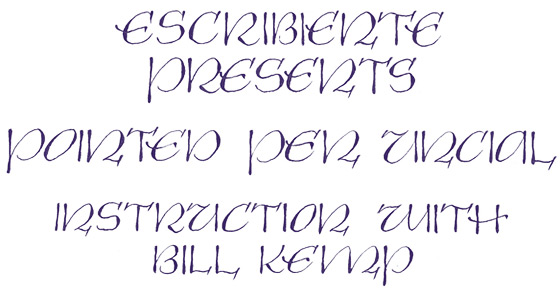
Introduction to the Pointed Pen
October 25, 2014

Escribiente presents Introduction to the Pointed Pen with Bill Kemp. This one-day class was designed especially for beginners to the world of pointed pens. The class introduced the students to the oblique pen holder, with a pointed nib. The morning session will be spent understanding how to use the oblique pen holder to make thick and thin lines, leading up to making a compound curve and flourishes. The afternoon was devoted to learning a simple alphabet: Weaver Writing Style (designed by the late Gwen Weaver).
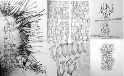
Pointed Pen Uncial
October 26, 2014
This script was developed by Mike Kesceg of Chicago, Illinois and Pen Graph Studios, Inc. Mr. Kesceg has owned Pen Graph Studios, Inc. since 1984. He has taught throughout the United States and has been a facility member on many international conferences. Mr. Kesceg is also a Master Penman through the International Association of Master Penman, Engrossers and Teachers of Handwriting (IAMPETH).
Good Hues
A workshop in color and design with Louise Grunewald
April 26 & 27, 2014
View Photos from this workshop on our Flickr page.
Course Description from Louise Grunewald:
 “Most artists I talk with express a joy in, or a longing for, authenticity and freedom in their work. This is easier to come by when one has certain basic skills and concepts “in hand", allowing the freedom to come from a firm foundation and taking some of the unnecessary struggle out of the creation of art.
“Most artists like color and like to use it in their work. Color, or the absence of it, can add depth and emotion to a piece. But it can also be a trickster, even when you think you know the color wheel. Why do some reds and blues look brown when mixed, instead of purple? Why do some neutrals just look like mud? Why do other neutrals make pure colors sing? I have been using a color formula for the past 20 years that has taken a lot of the guesswork out of these kinds of questions and has allowed me to simply have more fun with color in my work. It is this formula, developed by watermedia painter Stephen Quiller, that I will share with you in this weekend workshop, along with design fundamentals so you will learn how to apply color principles to finished pieces.”
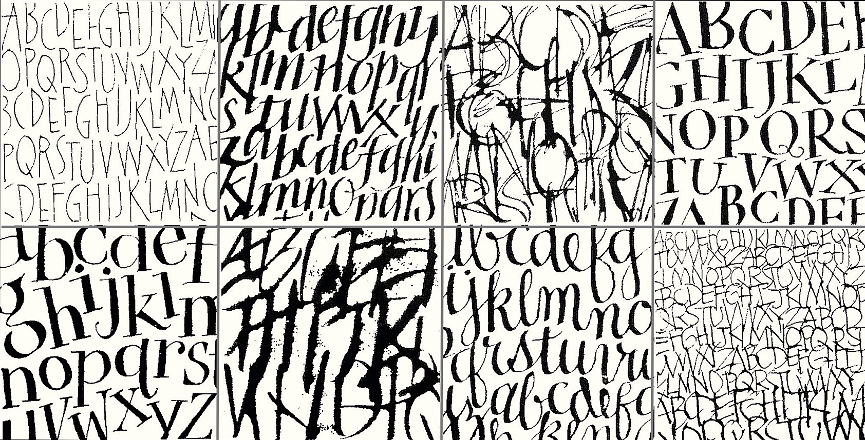
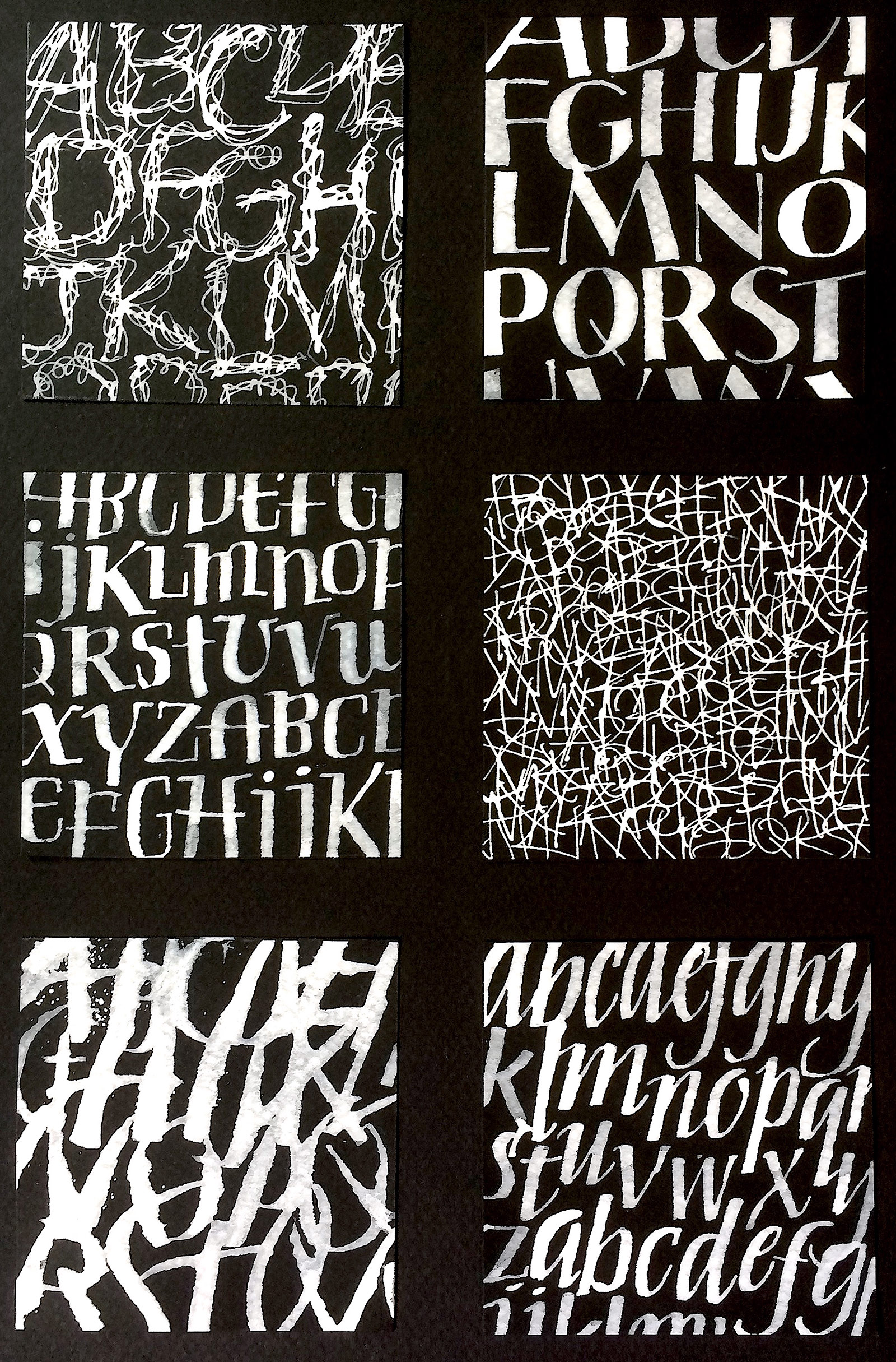
Lettering as Texture
Workshop with Amy Jones
January & February, 2014
View Photos from this workshop on our Flickr page.
In this workshop we utilized a variety of exercise for exploring lettering as texture. The principles and elements of design are integral to our playful exploration, where we created textured layers on which to letter legible words, or where we created abstract works of art in which lettering is perhaps unreadable. Multiple pieces were started and developed as techniques were introduced.
 Decorated Versals
Workshop with Peter Thornton
October 26–27, 2013
Decorated Versals began with a review of several colour and tonal exercises in both ‘harmony’ and ‘contrasts’, with a focus on greater tonal subtlety using natural objects. Exercises explored the rich reservoir of the many subtleties found in ‘neutrals’ and ‘greys’, both ‘warm’, ‘cool’ and ‘inert’ for a sustained sense of beauty and satisfaction.
During the 2nd day of this workshop, Peter worked on the spontaneously drawn letters that carried these new and more subtle colours as well as those of our own choices and preferences.
(Original workshop by Adolf Bernd)
Janet Takahashi
Artful Journal Workshop
November 3–4, 2012
 Our November 2012 workshop focused on sketching and creating an artful journal with freelance artist Janet Takahashi as our guide. Janet is a freelance artist with a “love of letters”, specializing in calligraphy, illustration, bookbinding, sign painting and gilding. She is an avid journal keeper, filling several books at the same time. Her book, Artful Journals is in its 2nd printing with Sterling Publishing 2007. Visit Janet’s website.
 Carl Rohrs – Pointed Brush Intense
May 5–6, 2012
Escribiente members were treated to a fabulous workshop with master calligrapher Carl Rohrs in May 2012. Using a Pentel Color Brush, Carl expertly demonstrated the pointed brush alphabet and shared many tricks of the trade. Each student was presented with an 100-page bound book of examples of both brush and ruling pen calligraphy that will inspire for years to come.